Law firm web design shares many of the same principles as building for other professional services industries like banking, insurance, and accounting – but is not entirely the same! In fact, law firm design fundamentals even differ within the legal space depending on the type of firm you operate. Plaintiffs personal injury firms operating on a contingency fee basis rely on a completely different set of messaging and web design principles than white-shoe firms representing multi-national corporations in complex business litigation.
In this article, we’ll review:
- basics of website design important for any website
- website design for law firms
- examples of good and bad law firm web design
- how to design a new website for your law firm
Basics of Web Design
Your website is a control plane for people to acquire knowledge and – ideally – contact your firm to become an intake
Designing a new website isn’t rocket science. At the core of the design process is the simple axiom well-expressed by this Google content strategist: The goal is to build something that empowers users to…well…use your site to do what they want to do. Whether that means learning more about your law firm and its history or trying to better understand if they’d like to pursue a specific legal matter, your website is a control plane for people to acquire knowledge and – ideally – contact your firm to become an intake.
To that end, some common elements of good web design include:
- Building a fast, accessible website. This one is straightforward. If the basic requirement of navigating to and being able to navigate through your site isn’t met, then all other points are moot.
- Using expressive, branded, and emotional messaging. Your law firm should stand apart and the key to this is copy that conveys your mission and spirit through each syllable.
- Building content and pages relevant to the user. It’s important to know what actions and information a user will be accessing your site for and transforming that knowledge into straightforward digestible content.
- Creating clear, action-oriented CTAs – or Calls to Action. These can range from buttons to images to inline links, but they need to share the commonality of driving visitors to take those actions which equate to conversion events for your firm (most likely calls and form fills).
- Applying contemporary web design principles to create engaging experiences which don’t feel outdated.
Law Firm Web Design
Earlier I mentioned that all legal practices aren’t the same and therefore don’t share the same website design best practices between them. Therefore, it’s important that as we continue, we make the distinction as to what type of law firm is under study.
Website Design for Personal Injury Firms
Copywriting
By far the most important messaging when it comes to any contingency fee law firm is the “free unless you win,” “free case consultation,” and essentially any other permutation of “free” tagline. This is a golden rule for any contingency fee firm.
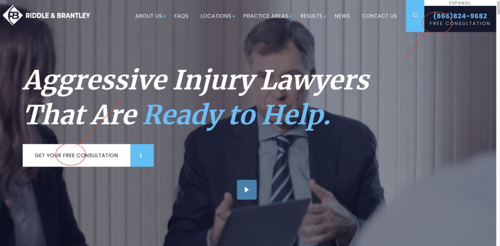
For best results, place this messaging above-the-fold (the portion of the page visible on screen at initial load), in the header, in the footer, and scattered generously throughout the body. Basically, take the number of places you think it belongs and double it. That’s the number of times the “free unless you win” message should appear.
Outside of this core message, the tagline copy you write can vary greatly depending on your brand’s mission and ideology. Some firms like being known for their aggressive nature, while others prefer recognition for outstanding compassion. The most important thing is that your tagline copy reflects the fundamental truths of your firm.
Content
Sites for personal injury law firms should always look to convert at least 2 different segments of users:
- Those who know they need a lawyer.
- Those who might not.
To address the first class of users, you need to provide content that separates your law firm from the multitude of others. This will largely come down to the quality and structure of your about us page, attorney profiles, history of results, and quality testimonials.
To address the second class of users, a robust blog is the tried and true method of educating users on the merits of their potential case and converting them to leads. Used in conjunction with strong linking through practice area pages, a blog is a powerful tool for generating case volume among this cohort.
CTAs
Of all plaintiffs firms, personal injury practices tend to have the most emotional CTA’s. And for good reason. You or someone you know has been injured, it follows that the actions surfaced by the website should reflect the turmoil of your current emotional state. While the tried and true variations like ‘Get a Free Case Consultation’ and ‘Learn More’ will always have their place in CTA construction, more descriptive copy can sometimes go a long way. Text like:
- Take Action Now
- Stand Up to Bullies
- Call Our Dedicated Team
Can be thrown into the mix for a more emotional response. Brownie points for constructing CTAs that tie directly to your brands’ creative copywriting.
Website Design for White-Shoe and Corporate Law Firms
Copywriting
Think in terms of ‘historic,’ ‘groundbreaking,’ ‘innovative,’ and ‘professional’ rather than ‘free,’ ‘fight,’ and ‘compensation.’
Unlike personal injury law firms and other contingency fee practices – which tend to primarily serve individuals – white-shoe firms mostly cater to other businesses. This paradigm shift requires a commensurate shift in tone and content of copywriting. Rather than focus on buzzwords like ‘free’ and other emotional slogans, it is important for these corporate firms to apply lofty, professional tones to their taglines. Think in terms of ‘historic,’ ‘groundbreaking,’ ‘innovative,’ and ‘professional’ rather than ‘free,’ ‘fight,’ and ‘compensation.’
Content
For large corporate law firms, a website is in many ways just another form of a business card. While it’s great and added gravy when it generates net-new business, its primary purpose is for looking up internal firm contacts, acting as the ‘public face’ of the firm, and distributing press releases and other noteworthy news.
To that end, content must focus heavily on the profiles of the firms’ attorneys, their accomplishments, credentials, and thought leadership. These profiles may then act as a natural jumping-off point to deeper depths on legal opinions, news and updates through the industry, and other broad scope content.
CTAs
In similar fashion to the notes above on copywriting and content, CTA’s for white-shoe law firms should steer clear of overly emotional text. It is wise to stick with conservative copy like:
- Watch Video
- See More
- Send Email
Sometimes the best design is about understatement, and this is certainly true for CTA construction on white-shoe law firm websites.
Examples of Good and Bad Law Firm Website Design
Now that we have a general understanding of the principles of good website design for law firms, let’s apply those principles to real-world examples.
Best Law Firm Website Designs
These law firm websites have implemented law firm website design best practices on their sites:
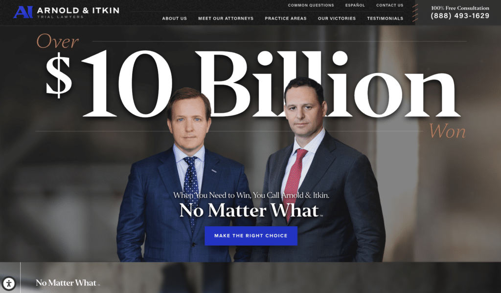
Arnold Itkin
A bold, branded message, clear calls to action, and contemporary design all contribute to making Arnold & Itkin a stand-out site for web design among personal injury law firms. Of course, they also nail the fundamentals with a solid PageSpeed index, accessibility options for impaired visitors, and the all-important “free” messaging.
Kirkland & Ellis
As a white-shoe law firm, the rules for Kirkland & Ellis differ dramatically from those of a personal injury law firm like Arnold & Itkin. Their law firm website design succeeds by combining impressive messaging with clear site navigation, all wrapped in a minimalistic, modern design.

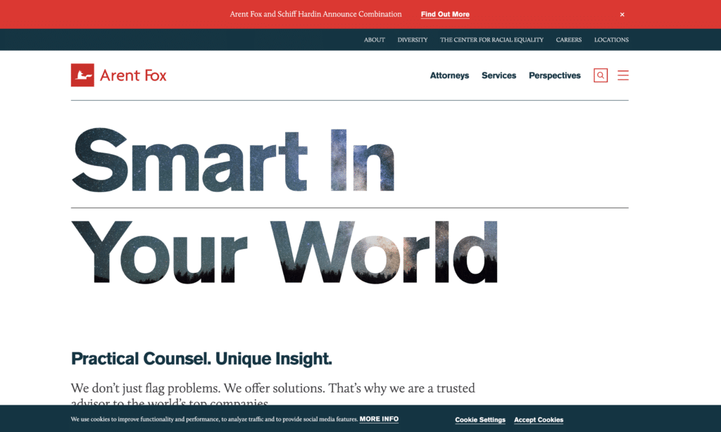
Arent Fox
Like Kirkland & Ellis, Arent Fox is a corporate law firm. Therefore conveying its history of success and innovative thought leadership in a visually satisfying way is imperative. Bold messaging and efficient use of negative space are the cornerstones of their web design success.
Not-so-good Law Firm Web Design
These law firm websites are lacking in one or more legal website design best practices and could use improvement:
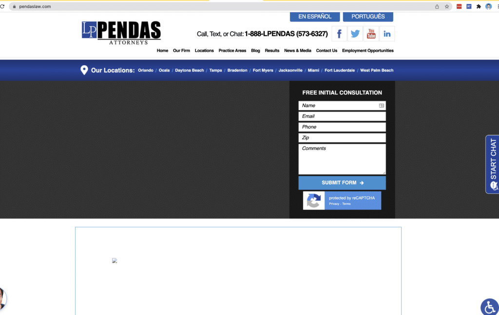
Pendas Attorneys
Unfortunately, Pendas is our first example of law firms lacking good web design. Broken images above-the-fold, a poor mobile PageSpeed score, and a dated site layout are the main factors in this judgement.
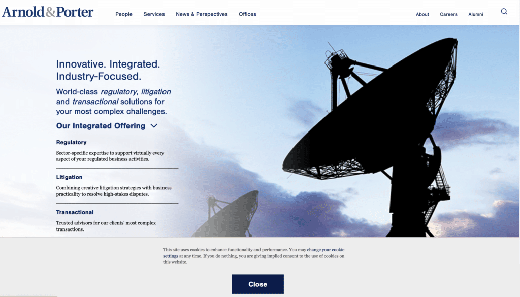
Arnold & Porter
I’m sure we won’t hurt any feelings when we single out Arnold & Porter as our first corporate law firm missing some design principles. As a top 100 white-shoe firm, something tells me this is a battle they can afford to lose. By tightening their messaging, improving use of space, and revamping CTA construction, they could easily ratchet up design quality.
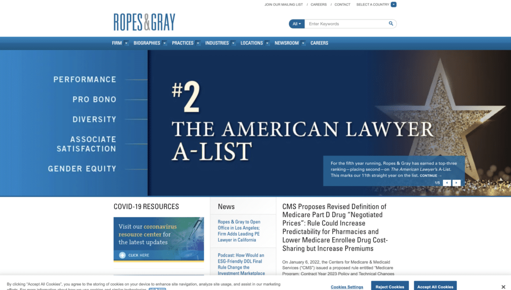
Ropes & Gray
Ropes & Gray is another top 100 white-shoe law firm. The firm has an amazing warehouse of content, everything from extensive news releases to webinars to biographies, however, the design of their website does the content a disservice. Modernizing and rethinking layout would go a long ways towards improving overall website design for these folks.
How to Design a Website for Your Law Firm
How your firm approaches the problem of redesigning and rebuilding your website depends greatly on your law firm and the resources available. If you have the budget, hiring a dedicated digital marketing agency with experience in the space can be a great option as it reduces the possibility of misfires and – in general – significantly cuts turnaround time. However, be wary of marketing and advertising companies that don’t have significant experience working with law firms. As we’ve seen in this article, though good website design in general shares common traits with good design for law firm websites, the two are not the same.
For some additional material we didn’t cover in this post, I encourage you to watch this workshop given last year on the fundamentals of website design for law firms. It includes additional examples of good and bad design from the wild and goes even deeper into the weeds on the execution of best practices for web design for law firms.
If you like this content and want more of it, we’d love to hear from you so we know to keep writing it! Send us an email at bark@meanpug.com, we don’t bite!


